Every options flow tool shows you a premium chart. Most of them stop there. You see $100M of call premium in an afternoon, you scroll down to a table of trades, and nothing connects the two. Which of those prints cleared the bar, and when did they hit? Were they real positioning or a hedge? Did the position still exist the next morning? The Options Explorer now answers all three, on one page, and it is live today.
A timeline with a lane
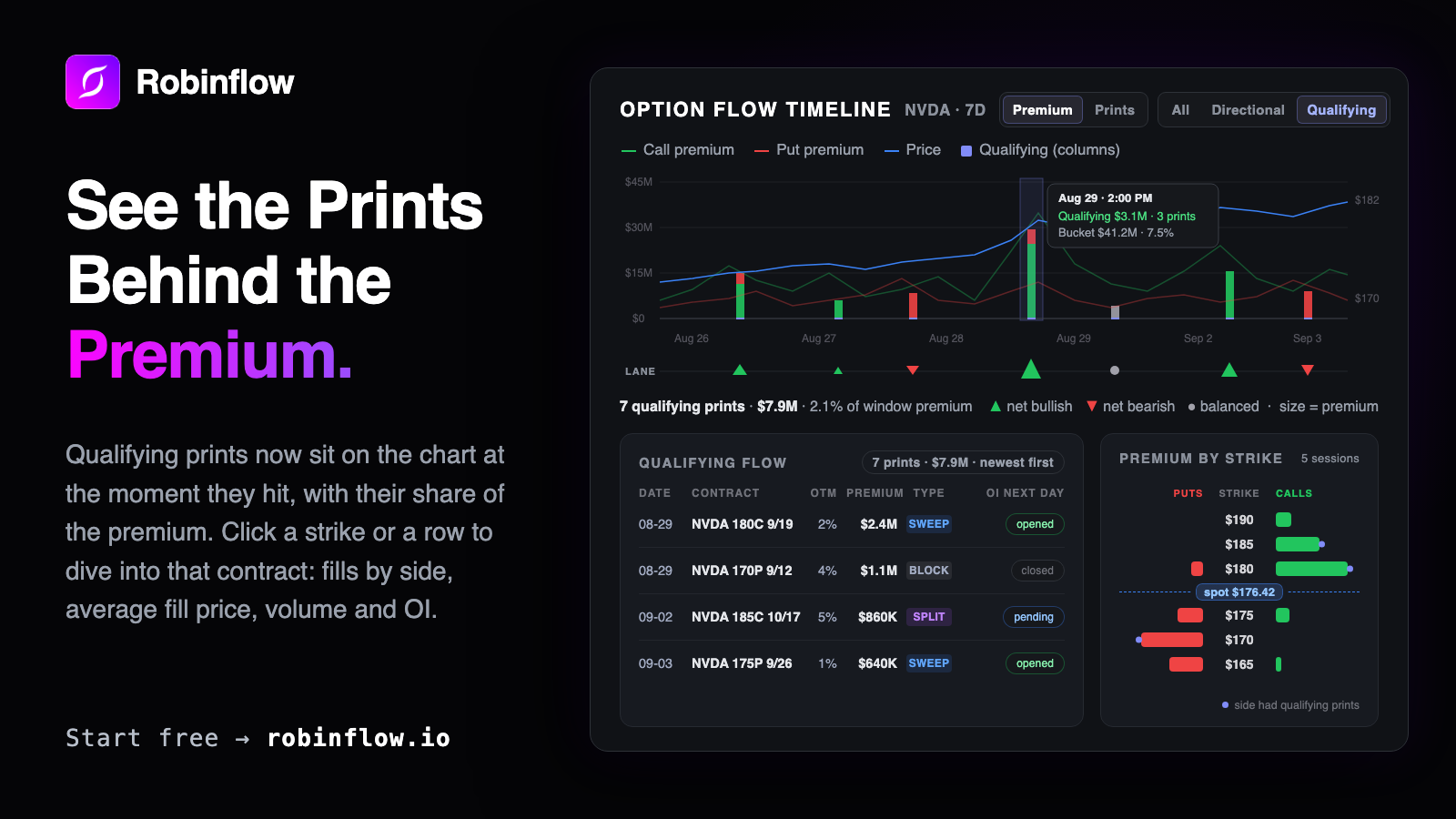
The premium chart is now the Option Flow Timeline. It plots call and put premium against price, in Premium or in Prints, across three modes. All shows everything that traded. Directional strips out stock-tied packages, the deep in the money and floor-cross prints that are hedges rather than views, which on a busy day can be a third to a half of a name's dollars. Qualifying goes one step further and shades only the prints that cleared our size and aggression rules.
Under the chart runs a new lane. Each time bucket that contains qualifying prints gets one glyph: up for net bullish, down for net bearish, a dot when the two sides balance, sized by premium. Hover a glyph and the matching rows light up in the Qualifying Flow table below. A qualifying print does not need a spike to earn its glyph, and a spike with no glyph is telling you something too: that bucket's premium was hedged or sub-threshold. The lane is the bridge between "$41M in this bucket" and "these three prints," and it is the reason this release exists.
A caption under the lane keeps you honest about the denominator: seven qualifying prints, $7.9M, 2.1% of the window's premium. Qualifying flow is usually a small share of the total. We would rather say so than let a shaded chart imply otherwise.
Did the position actually open?
A big print on its own is ambiguous. It can be an opening trade, a close, or a roll, and the tape alone cannot tell you which. Open interest can. Every qualifying print now carries an OI next day chip: pending until the morning data posts before the open, around 8:30 AM ET, then opened if open interest rose by at least half the print's size, closed otherwise. Opened means the position stuck. It now sits in the row where you need it.
Click a strike, see the contract
The right rail gained a Premium by Strike ladder: puts on the left, calls on the right, spot marked in its own lane, and an indigo dot on any strike that carried qualifying flow. Each half of each bar is a click target. Click one, or click any qualifying row or any open interest change, and Contract Activity opens in place below the table: that contract's premium by execution side, session by session, with its average fill price overlaid on the right axis so you can see what the buyers actually paid, and stat tiles for volume, premium, open interest, and fill. Drop the window to a single day and the same chart breaks into hourly buckets. Switch the scope from the single contract to every expiry at that strike, or every strike at that expiry, and the numbers reconcile with what you clicked.
Tiles that show their work
The Flow Summary tiles were rebuilt around the same honesty. Bullish and bearish now state how much premium had a side at all, and what share was unattributed at the mid, because a 70% bullish reading over a small sided base is a different thing from 70% of everything. Put/call is reported by prints and by premium, since the two often disagree, and a new Average $ per contract tile separates a handful of large prints from a stream of small ones.
Everything on your phone
All of it ships on mobile in the same release: the timeline with a coarser lane, the flow rows with their OI chip, the strike ladder as its own card, and Contract Activity as a bottom sheet instead of an inline panel.
One thing it is not
Qualifying flow is what cleared our rules. It is positioning, not a forecast. When we measured it, flow within two days of earnings was the one context where we measured an edge, and we say that inside the product rather than dressing every glyph up as a signal. The value of this release is that you can now see, for any spike, exactly what was behind it and whether it lasted.
The Options Explorer lives under Explorer in the app, and any ticker anywhere in Robinflow opens it. It sits next to Street vs Tape on the same page, one click from the name's options flow and dark pool prints, and it is included in every plan. Start a 30 day free trial to try it on a name you follow.