Single name flow is noisy. One large sweep can be a hedge, a roll, or a rebalance, and on its own it tells you very little. Sector rotation is different: when aggressive money keeps showing up across a whole group of names, that is where institutional conviction tends to show first. Sector Overview is built to make that visible, and it is live today.
Where is the money actually going?
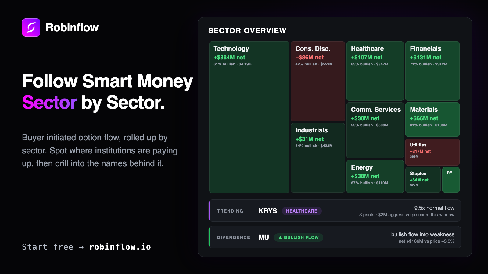
Sector Overview rolls buyer initiated option flow up into a sector map. Calls bought at the mid or better count as bullish, puts bought the same way count as bearish, and trades that hit the bid are excluded entirely, because a seller leaning on the bid is not the conviction we want to measure. Each sector is sized by the premium behind it and colored by direction, so a glance tells you where the aggressive money is concentrating and which way it leans. Windows run from 1D to 30D, so today's picture sits next to what has been building over the month.
One note on the numbers. This metric, Aggressive Net Flow, is deliberately narrower than the Net Flow on the dashboard, so the two can disagree for the same symbol. That disagreement is information: it tells you how much of a name's flow is actually aggressive rather than passive.
Trending names and divergences
Inside every sector, each symbol is compared with its own 20 day normal, so a name reads as "5.4x normal flow" rather than as a raw dollar figure that favors the largest tickers. When the print count behind a reading is low, we say so, and names with fewer than three prints sort after names with real participation, because a handful of trades should not carry the weight of a hundred. Every symbol row also carries its price change over the window, so you can see the tape and the price side by side.
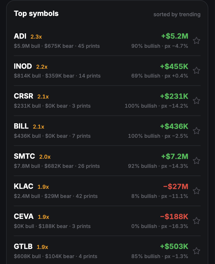
Divergences flag names where the flow points one way while price moved the other: bullish flow into weakness, or bearish flow into strength. These are observations about positioning, not predictions about what comes next, but they are exactly the spots worth a second look.
One click into the Explorer
Any sector drills into its names, and any symbol opens the Options Explorer's Street vs Tape view, so analyst consensus sits next to the tape for that ticker. From there the usual paths are open: the name's options flow and dark pool prints are one click away.
Sector Overview lives under Sector in the app. Read more on the Sector Overview feature page, or start a 30 day free trial; it is included in every Robinflow plan.